Introducing The New Look for SWF
Wednesday, September 8, 2021
by Executive Director Peter Martinez
Organizations, like people, grow and evolve in response to changing circumstances, challenges and opportunities. Every once in a while, an organization should stand back and assess itself in light of its current context and circumstances, and also with a view to where it aims to go in the future. At SWF we have just completed such an exercise as part of our broader strategic planning activities carried out during 2020 and 2021. This has led to a new logo as part of a general refresh of the SWF brand.
The new SWF logo symbolizes our role as a facilitator of dialogue and a promoter of cooperative solutions for space sustainability. The design incorporates classical elements from Eastern and Western cultures, symbolizing our belief that all perspectives must be included to achieve a shared understanding for effective cooperative governance of space activities.
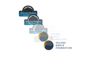
The orange edge with arcs radiating from one point symbolizes the new dawn in space activities, with the emergence of many new space actors and a growing diversity of activities. These developments hold out the hope of great benefits for humanity, but also raise concerns about challenges to the sustainability of space activities caused by orbital congestion, space debris and a proliferation of counterspace activities, which are all issues that form part of our work.
The orange arcs allude to the different orbits being used by an increasing number of nations and space actors. They signify SWF’s role in promoting better governance of space activities and disseminating that framework globally. The arcs also signify that SWF is constantly looking over the horizon in multiple directions to identify and address emerging space governance challenges.
We value diversity and inclusion in our organization and its activities. The orange arcs also symbolize SWF facilitating the discussion of issues, with different stakeholders working in nested cooperation, ideas being generated and radiating outward into expanding dialogue and shared understanding.
We acknowledge that space sustainability is an inter-generational challenge. For this reason, SWF strives to raise awareness among the next generation of space professionals about the importance of good governance and space sustainability. This element of passing the torch to the next generation is also depicted by the orange lines curving downwards that symbolize the flame of knowledge being passed down to the next generation.
The corporate colors of SWF are dark blue and orange. The use of blue as a corporate color is very prevalent in the space community. SWF’s deep blue denotes that we take pride in being part of this community. By contrast, the use of orange is rare in the space community, so the orange in this logo makes it stand out, which serves as a reminder to us that we should strive to be a thought leader in the areas of space governance, space sustainability and space security. Moreover, blue and orange are complementary colors, symbolizing SWF’s desire to work in harmony with our peers and others.
SWF strives to bridge cultural, geographical, disciplinary and other differences through promoting inclusive multi-stakeholder dialogues. The typeface used in the logo is Noto, a font family that is designed to achieve visual harmony in terms of allowing for compatible heights and stroke thicknesses across multiple languages/scripts. This choice of typeface signifies SWF’s commitment to supporting dialogue through promoting inclusivity in our activities and taking measures to make our activities and products as widely accessible as possible.
Taking together all the considerations above, this new logo is an outward symbol that reflects the values, ideals, vision, and mission of SWF. It will serve as a daily reminder to those of us working at SWF of why we choose to do what we do and what impact we hope to have on the world, as well as a goal that we hope to strive towards. In the coming months, we will be rolling out the new logo as part of a larger refresh of our programs, projects, and initiatives that take fresh stock of the challenges we face and provide a path towards realizing a more secure, sustainable, and peaceful future for all of us.
 Share
Share